📌 Key Takeaway: Uniform design turns a business into something customers recognize before they read a single word. When your truck decals, crew shirts, statements, website, and customer portal all look like they came from the same company, you create familiarity, reduce confusion, and make every interaction feel intentional.
Brand recognition is not built by a logo alone. Customers remember a business when repeated touchpoints look and feel the same. A homeowner who sees your crew arrive in the same branded shirts every week, receives a clear statement in the same visual style, and logs into a customer portal that matches the rest of your brand starts to associate your company with professionalism. That consistency matters because most small businesses only get a few seconds of attention at a time. Uniform design makes those seconds count.
For lawn service companies, this is more than a marketing theory. You are visible in neighborhoods, on driveways, in email inboxes, and in payment workflows. If each touchpoint feels disconnected, the brand disappears into the background. If each one reinforces the same look and message, the brand becomes easier to remember, easier to recommend, and easier to trust. That is the real value of uniform design: it turns routine service into a recognizable business identity.
Housing data shows why that matters. US housing starts reached 1465.00 k starts (SAAR) on April 1, 2026, which means there are still plenty of homes entering the market that will need recurring lawn care, clear communication, and dependable service presentation. New homes create new customer relationships, and the companies that look organized from the start have an easier time earning them.
Why uniform design makes your brand easier to remember
People remember patterns faster than isolated details. When your business uses the same colors, typography, logo placement, and tone across every customer-facing asset, the brain has fewer signals to sort through. The result is recognition. A customer may not be able to describe every element of your brand, but they will know it when they see it again. That familiarity shortens the path from first impression to trust.
This is especially important in lawn service, where much of the work happens out of sight. Your crews may do excellent work on the property, but the customer is often judging the company through the materials they see before and after the visit. A branded statement, a polished mobile app experience, and clean reports all reinforce the same story: this is a company that runs on systems, not improvisation. That perception drives confidence, and confidence drives retention.
Uniform design also makes word-of-mouth stronger. A referral works better when the recommended company has a look people can describe and remember. “The one with the blue shirts and the clean statements” sticks far better than a generic description. In a crowded local market, memorability is a competitive advantage, and consistency is what creates it.
The housing market feeds that effect too. April 1, 2026 still showed strong housing activity, with new homes continuously adding addresses to service. Every new homeowner becomes a potential long-term customer who has to choose a service provider fast. A company that presents itself clearly has a better shot at becoming the name they remember after the first quote, the first visit, and the first statement.
What visual consistency should actually cover
Uniform design works best when it extends beyond the logo. A strong brand system covers the full set of visual signals customers encounter. The logo is the anchor, but it needs support from the rest of the design system or it will feel isolated.
Color is one of the fastest ways to create recognition. If your website, statements, crew shirts, truck graphics, and social content all use the same core palette, customers begin to associate those colors with your company. Typography matters too. A small set of fonts, used the same way in headers, body copy, and customer-facing documents, creates order and makes materials feel professional. Imagery has the same effect. If your photos and graphics all share a common style, the business feels coherent instead of pieced together.
This applies to service companies more than many owners realize. A lawn business that uses one design style for a postcard and a completely different one for the customer portal sends mixed signals. Customers may not consciously notice the inconsistency, but they feel it. Consistency tells them the company pays attention. That message supports every other part of the customer experience.
The goal is not decoration for its own sake. The goal is to make every branded item look like part of the same system. When that happens, the company becomes easier to identify, easier to trust, and easier to remember after the truck leaves the driveway.
How branded operations reinforce recognition
Brand recognition is strongest when design shows up in daily operations, not just in marketing. A company can have a good logo and still feel forgettable if the customer experience is messy. The practical answer is to carry the same visual identity into every operational touchpoint.
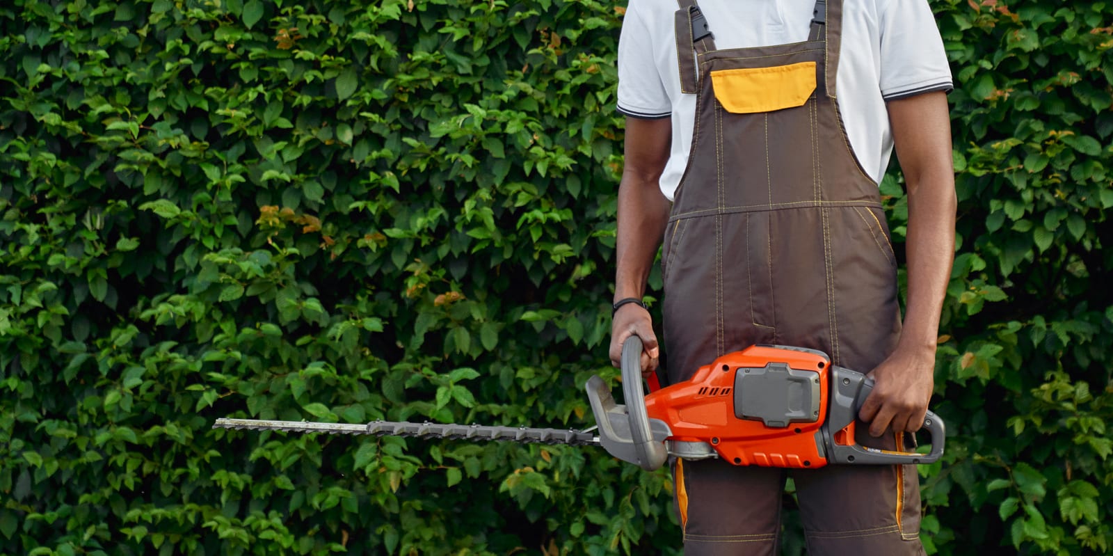
Start with the crew. Branded shirts, vehicle graphics, and clean job paperwork make the business visible in the field. Homeowners notice when technicians look coordinated and professional. They also notice when the paperwork they receive matches the same brand they saw on the truck. That repetition creates a sense of reliability.
Statements are another major touchpoint. With EZ Lawn Biller, your billing process is built around statement-based billing, so the homeowner sees a running balance that reflects the relationship over time. That document should feel like part of the brand, not an afterthought. The same logo, colors, and layout style should appear on the statement, in the customer portal, and in any payment communications. When the statement looks polished and consistent, it reinforces the business’s image every time the customer checks a balance or makes a payment.
That is where complete lawn service management software helps. Billing, routing, treatment tracking, visit reports, mobile app usage, customer portal access, reports, payroll, and QuickBooks integration all affect how the brand is experienced. A business that manages these functions in one system can present a far more uniform identity than a company juggling separate tools that each look different. The result is operational consistency with a visible brand payoff.
The same principle applies as neighborhoods continue to grow. More homes mean more first impressions, and first impressions happen fast. A clean truck, a consistent statement, and a professional portal make the business look established before the customer ever asks about price.
Build a simple brand system before you scale
The strongest brands do not rely on improvisation. They define a system and apply it everywhere. For a lawn service company, that system should be practical enough that staff can use it without constant supervision.
The first step is to define the basics. Choose a small color palette, a primary logo version, a secondary logo version, and a standard set of fonts. Decide how those elements will appear on statements, the website, print materials, and digital communications. Then document the rules. A short brand guide is enough if it clearly answers the most common questions: which logo goes on a statement, what colors are approved for customer-facing materials, and how much space should appear around the logo.
The next step is to apply the same design decisions to service documents. Visit reports, treatment logs, payment notices, and customer portal screens should all look like they come from the same company. This is where many businesses drift. They invest in a polished website but let operational documents become plain, inconsistent, or hard to read. That weakens recognition because the customer sees the gap between the public brand and the actual service experience.
Training matters as well. Office staff, field techs, and managers should know what the brand looks like and why it matters. If someone creates a new flyer, edits a statement template, or sends a customer message, they should be able to follow the same rules. Uniform design only works when the whole team protects it.
Consistency on statements and payment pages matters
The payment experience is one of the most overlooked places to strengthen brand recognition. Customers may not think of billing as branding, but they do form an impression from every statement they receive and every payment they make. Clear, professional billing materials reduce friction and increase confidence.
With EZ Lawn Biller’s billing and payments feature, the statement is part of the customer relationship, not just an accounting record. That makes the visual presentation important. When a homeowner sees a clean statement with your logo, your brand colors, and a layout that is easy to read, the experience feels organized. When they can pay the balance or a custom amount through the customer portal, that same brand consistency should carry through the payment flow.
This is where uniform design has a direct business impact. A confusing statement creates questions. A polished one creates trust. A customer who feels comfortable with the payment process is more likely to stay current, use auto-pay, and view the company as dependable. That confidence does not come from a slogan. It comes from repeated visual and functional consistency.
Businesses that treat billing as part of branding also avoid a common mistake: letting operational documents look generic while marketing materials look polished. That split weakens the brand. A strong company uses the same standard everywhere, from the first estimate to the monthly statement. The customer should never feel like they are dealing with two different businesses.
The customer portal should match the rest of the experience
A customer portal is not just a utility. It is a branded environment where customers interact with your business on their own time. If the portal looks disconnected from the rest of your materials, it breaks the sense of continuity. If it matches your other touchpoints, it strengthens recognition every time the customer logs in.
The same logic applies to the mobile app experience, reports, and notifications. Each one should feel like part of a unified system. Customers may use one channel to check a statement, another to view visit reports, and another to make a payment. If all of those interactions share the same design language, the business feels organized and dependable. That impression is powerful because it reduces uncertainty.
Consistency also helps customers navigate more easily. When labels, button styles, and layouts are predictable, people spend less time figuring out where to click and more time completing the task. That ease matters. A smooth experience makes the business feel modern and professional. A fractured experience makes even a good service feel harder to trust.
For lawn companies using complete lawn service management software, the customer portal becomes one of the strongest brand assets in the whole operation. It connects the administrative side of the business to the visual identity customers see elsewhere. When done well, it turns routine account management into another brand touchpoint.
Use field presentation to make the brand visible in neighborhoods
Uniform design is not limited to screens and documents. In lawn service, the brand lives in the field. Every driveway, every route stop, and every customer interaction is a chance to reinforce recognition in public.
Branded uniforms are the simplest place to start. When a crew arrives wearing the same professional apparel, the business looks organized before work begins. That presentation matters to the homeowner and to the neighbors watching from the street. The truck should carry the same visual identity. Clean vehicle graphics extend the brand beyond the job site and turn every route into moving advertising.
The same principle applies to visit reports and service summaries. If a homeowner receives clear, branded documentation after a treatment or maintenance visit, the brand follows the crew home. That continuity matters because it links the visible work on the property with the paperwork in the customer’s hands. The more those materials match, the more the business feels established.
Field presentation also supports referral growth. People are more likely to recommend a company that looks professional and easy to describe. A consistent visual identity gives them something concrete to remember. That is one reason uniform design works so well for service businesses with local routes: the brand is seen in the neighborhood again and again, not just online.
Keep the design system simple enough to maintain
A uniform design system only works if people can actually use it. Overly complex branding creates mistakes. The best systems are simple, repeatable, and hard to misuse.
That means limiting choices. Use a defined color set rather than a long list of optional shades. Choose a small number of fonts. Keep logo rules straightforward. Standardize templates for statements, reports, emails, and printed materials. When the system is easy to apply, it stays consistent across staff members and locations.
It also helps to review materials regularly. A business can drift without noticing. A new template gets made. A staff member exports a report with different styling. A flyer uses a different color. Individually, these changes seem small. Taken together, they weaken recognition. A quick audit of customer-facing materials catches those issues early.
Software makes this easier. When a business uses one platform for billing, routing, treatment tracking, visit reports, customer communication, and payroll, there are fewer places for the brand to splinter. Templates stay aligned. Documents are generated from the same system. The result is less manual cleanup and a more consistent customer experience. That consistency saves time and protects the brand at the same time.
Recognition grows when the brand and the operation match
The strongest brands do not look polished while the operation feels chaotic. They match. Uniform design works because it reflects an underlying order in the business itself. Customers notice when the visual identity and the service experience tell the same story.
A lawn company with reliable routes, clear statements, organized treatment records, and professional customer communication has more to work with than a business that is improvising every day. The brand becomes a visible signal of operational discipline. That matters because customers are not only buying mowing or treatments. They are buying confidence that the company will show up, communicate clearly, and handle their property with care.
That is why complete lawn service management software supports brand recognition so well. It helps the company present one face to the customer across billing, routing, reports, mobile work, and account management. The brand stops being a design exercise and becomes part of how the business runs. That is the level where recognition turns into loyalty.
For lawn service companies, the opportunity is straightforward. Make the logo, statements, portal, crew presentation, and customer communications look like one company. Keep the system simple. Apply it consistently. Then let the operation prove the brand is real. When customers see the same quality everywhere, they remember the name, trust the service, and come back season after season.
If you want a brand that customers recognize quickly and remember easily, start with the systems they see most often. A consistent look across billing, routing, reports, and customer communication is one of the fastest ways to turn a local lawn business into a brand people can identify at a glance.
Related: EZ Lawn Biller